Popular Interior Paint Colors
The “most” popular interior paint colors change from year to year as trends change and the large paint manufacturers ramp up marketing on one segment or another of their color palette.
Keeping up with those year to year color trends would drive the average homeowner (and the interior painter) mad.
The good news is that despite all that annual change, the overall popularity of certain colors and color families remains steady.

The top 20+ best-selling paints from all the major manufacturers are always neutrals. Neutrals have the most flexibility. They go with nearly everything, they give surfaces a fresh clean look, they allow you to bring in color through accessories and fabrics and décor.
I won’t focus entirely on neutrals – We’ll take a look at some of the most popular paint colors from the other color families as well. These colors often pair well with neutrals to create contrast and visual impact.
Popular Interior Paint Colors
Whites
White is an enduringly popular interior paint color choice, and bright whites are nearly always the top sellers of all the major paint brands. Behr’s “Arctic White” and Benjamin Moore’s “Simply White”, for example, are perennial bestsellers.
These bright whites are great options for trim and ceilings. They brighten a room and can enhance the sense of space, making a small room appear larger and more expansive.
It works great in hallways, bathrooms, basements, or areas where color is abundant through woodwork, décor, floorcoverings, or accent paint colors.
The upside of bright white – its complete flexibility and neutrality through lack of color – is also its biggest detraction. Too much “pure” white can create a sense of coldness and sterility. That’s why I tend to prefer:

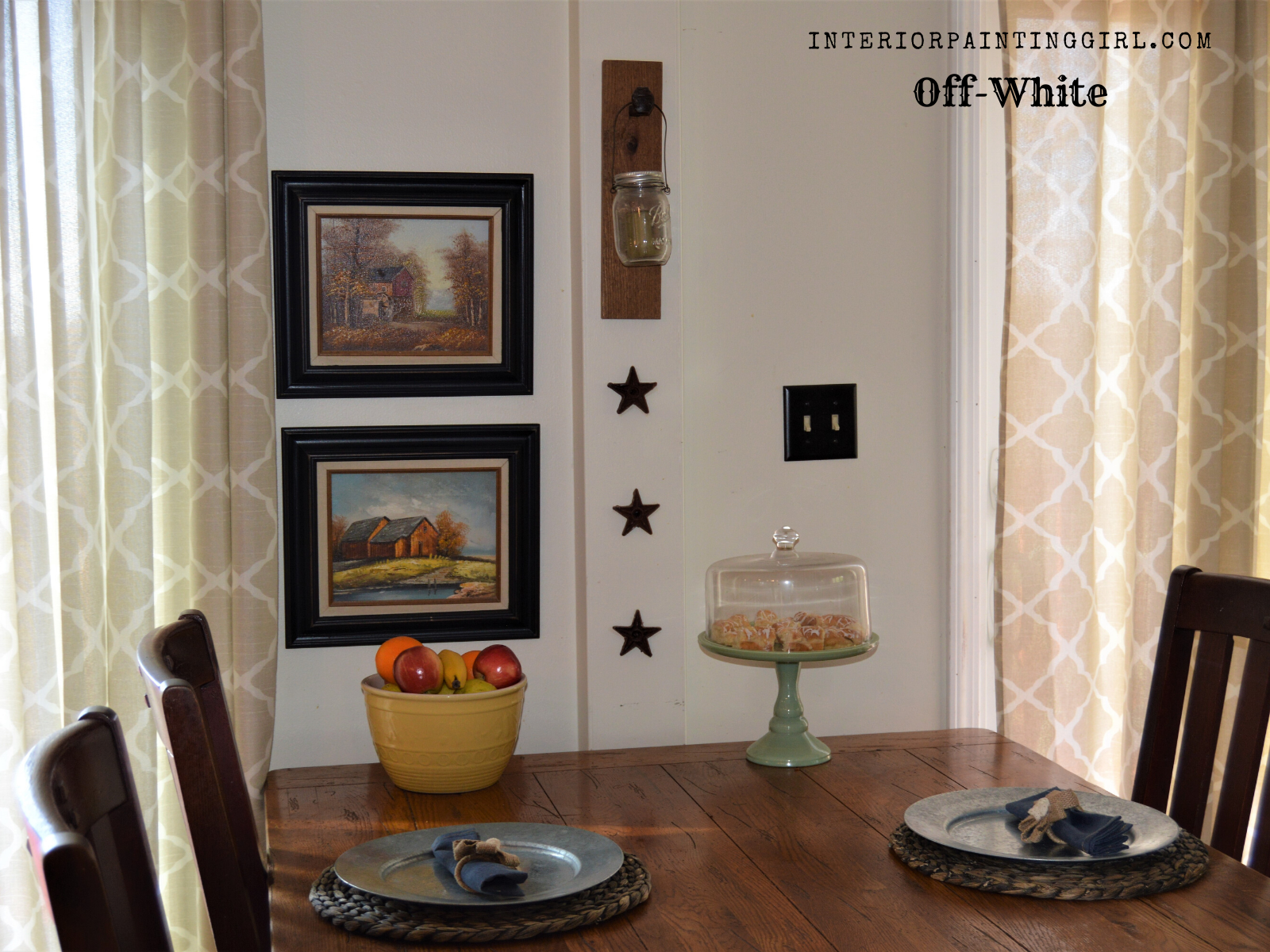
Off-Whites
Off-whites have all the strengths and flexibility of pure whites, but often with an added feeling of warmth. They allow rooms to feel large and spacious and bright, while adding a softness especially in warm lighting.
Off-whites can vary from creamy whites with hints of gold or brown to pale gray-whites. They remain versatile option for walls, trim, and ceilings that can add special pop to your décor and openness to your space.
I use various off-whites in place of pure whites throughout my own home on ceilings, walls, doors, and trim to give each room its own special character while maintaining the flexibility and brightness of white.
Some popular interior paint colors in off-white from from major brands are “Antique White” by Sherwin Williams and “Heavy Cream” by PPG Paints. These both have varying warm yellow undertones that catch light and reflect back the warmth.
Light Grays
Light Grays (and greiges) have been the trendiest of neutral paint colors over the past several years, and several examples can be found on the major brands’ bestseller lists.
Light grays are understated and offer a subtle elegance where pure whites can at times be brash and overwhelming.
At the same time, light grays work best when paired with whites (such as bright white trim or doors), to provide contrast and give depth to the gray. A room coated entirely in light gray without such contrast can look washed-out and a little dingy.
Light grays work great in transitional spaces such as hallways as well as anywhere spaces tie together without walls to divide them (such as dining and living rooms). They can also work as a great base color in a room with a single more dramatic accent wall.
Examples of the most popular interior paint colors in light gray include “Cool Slate” from PPG Paints and “Stonington Gray” from Benjamin Moore.

Dark Grays
Dark grays are always popular interior paint colors and they are considered separately from light grays since their uses and impact are so different within a space.
Charcoal and dark grays convey both warmth and sophistication within a space. Yet they can be easy to overuse. They require contrast with lighter colors to achieve their full impact and pair best with light grays and off-whites.
They can provide a feeling of depth and class to a master bedroom or living space, especially if used as an accent wall, half-wall, or contrasted against both lighter and darker tones.
Some examples of popular dark grays include “Cityscape” by Sherwin Williams, “Graphic Charcoal” by Behr, or Dutch Boy’s “Antiquated Chain”.

Beiges
Beiges remain one of the most popular paint colors year after year. They are a very flexible color family that ranges from the trendiest “greige” to creamed coffee tones to hues with a blue or purplish undertone.
Greige has been one of the most popular trends for several years. It combines the subtle sophistication and modernity of light gray with the slightly warmer tints of brown. It works great in kitchens, living rooms, laundry rooms, and other areas where it can be paired with darker or brighter accent colors.
Classic beige, which is a brown-white or gold-white, highlights and pairs great with browns (such as natural woods, fabrics, leathers) as well as reds and even certain blue tones.
Some of the most popular beiges (and greiges) are “Woodland Stone” and “Soulful Grey” from Valspar and “Manchester Tan” from Benjamin Moore.
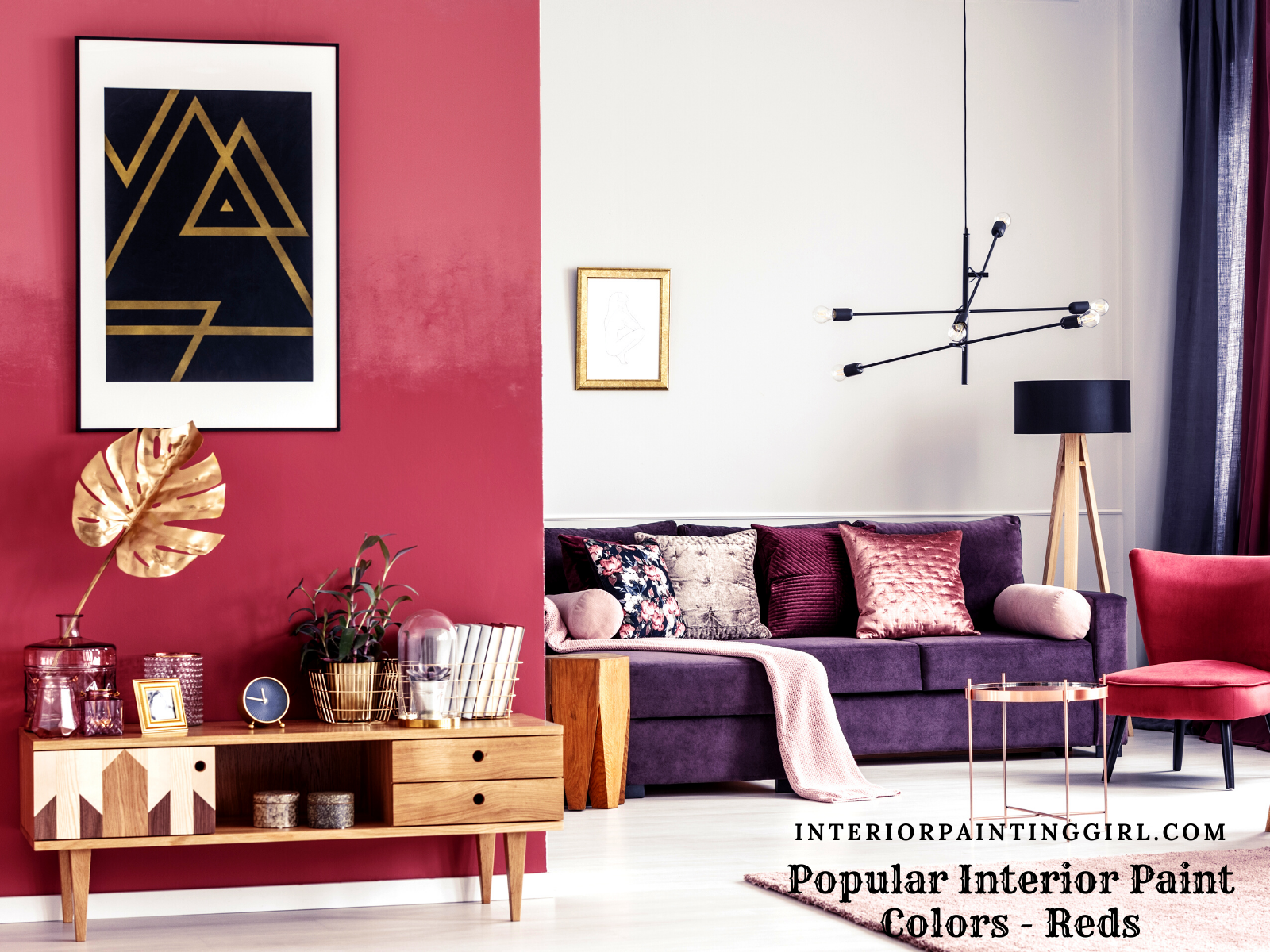
Reds
Reds always feel a bold choice for DIY homeowners who really want a punch of color but aren’t sure when they’ll be taking it “too far”.
Reds can be a fantastic choice for interiors, especially in self-contained spaces where creativity, energy, or passion are sought. One common mistake is failure to temper red with secondary colors and décor, or to give too little contrast between red walls and other accessories.
Red works best as an accent (such as a single accent wall) or with earth tones and in contrast with lighter colors or tones such as whites, creams, grays, or beiges.
It can make a dramatic statement and set the mood in a kitchen, study, bathroom, or dining room. Burnt siennas and coppery reds feel earthy and less overpowering than pure cherry reds.
Note: Be cautious with pure reds, as so much tint needs to be added to the base of these paints that they apply thinner and thus may take multiple coats to evenly cover previous surfaces.
Pinks are also in the red family and can be great options as accents and soft feminine touches to baby nurseries, kids’ rooms, and playspaces.
Some popular interior paint colors in red are Behr’s “Red Pepper” and Sherwin Williams’s “Sierra Redwood”.
Greens
Greens are the most calming and naturistic color family and can range from dark hunter greens to minty greens to pale sages.
Because of its association with lush nature, our bodies find it extremely appetizing, making it a great interior color choice for kitchens, as well as a great relaxing choice for living rooms and bedrooms.
Rich dark greens have become popular interior paint colors to use as accent colors, either in as part of an accent wall or as a trim and molding color, especially in living rooms and studies. Light gray or beige walls with a dark green accent such as Sherwin Williams’s “Pewter Green” or PPG’s “Nightwatch” make a huge impact.
Soft sage greens, on the other hand, have a very relaxing and calming impact on a space and can function as a great alternative neutral tone without feeling “bland”. They work great with dark woods, soft whites, dark blues, and even mustards.
The most popular interior paint colors in light greens include Benjamin Moore’s “Flora” and Valdspar’s “Sparkling Sage”, which has slight blue undertones and cottagey maritime feel.
Blues
Blues are some of the most popular interior paint colors outside of neutrals, and like greens they can provide a wide range of different atmospheres to a space.
Dark blues can be moody, sophisticated, and elegant without feeling too cold. They pair great with bright and off whites – navy and white is a timeless combination – or pair a dark blue accent with tan or even a pale yellow.
Some of the most popular dark blues are Benjamin Moore’s “Hale Navy” and Sherwin Williams’s “Granite Peak”.
Also popular are blue jewel tones, which pair fantastically as accents with white or gray walls or décor. Behr’s “Blueprint” is a popular example of a jewel tone.
Pale blues – like pale greens – can perform the role of a neutral, providing a muted but interesting background for natural woods and colorful décor. They can work great in a palette with darker blue tones.
Pale blues can also have an extremely “cottage” feel, think New England seafront.
Two popular interior paint colors in pale blue are PPG’s “Dartmoor Mist” and Dutch Boy’s “Silenced Blue”.

Yellows
Yellows are a great way to bring the sunshine inside! Popular yellows vary in tone from deep golden mustards to Provencal orange-yellows to bright pale sunshine.
Yellows should be used in some moderation, because while they can certainly brighten and cheer a room, they can easily become overpowering if used too heavily without the balance of darker or earthier tones.
Darker yellows or golds are great for accents, furniture, or cabinetry when balanced with neutrals or darks, especially charcoal grays. One of the popular interior paint colors in rich yellow is Sherwin Williams’s “Cut the Mustard”, which combines gold with a hint of brown.
Pale yellows are great to add brightness to an entryway, kitchen, or child’s room. Think “Winnie the Pooh” or for living areas pale wheat tones. Benjamin Moore’s “Hawthorne Yellow” is a popular and common yellow tone. So is Valspar’s “Homey Cream”, which has more of a muted yellow earth tone that brings brightness to the room without overwhelming.
I hope this list of popular interior paint colors has helped you to narrow down your list of choices.
If you’re looking or more tips or inspiration, visit our other interior painting colors pages – Choosing Interior Paint Colors, Interior Paint Color Combinations, and Best Interior Paint Colors.

"I did not know how to paint or even what to paint, but I knew I had to begin." Margaret Atwood, Cat's Eye
Join my monthly email newsletter, "Dip & Swipe", for professional tips, how-to articles, color and decorating ideas, projects, and much more!
Recent Articles
-
Repurpose Old Windows
Dec 10, 21 06:32 PM
 Learn how to repurpose old windows by upcycling them into shabby chic decor.
 -
Upcycling a Toolbox
Dec 08, 21 10:22 PM
 In this craft painting project, I upcycle an old toolbox with fresh paint and an appliqué.
 -
Craft Painting Projects
Dec 08, 21 08:13 PM
 A place for all of my smaller craft painting projects and DIY projects that don't fit elsewhere.
Follow me on Pinterest @