Choosing Interior Paint Colors
Choosing Interior Paint Colors is one of the most challenging and overwhelming duties in any painting project.
It is also one of the most rewarding.
There are simply so many choices. Every paint company has its own deck of many hundreds of colors. They are laid out side-by-side, in a multitude of shades from light to dark.

To add to the complication, you’re given a one-inch square sample of the color in the cold florescent lighting of a paint store and expected to envision it over an immense area of wall space, with furnishings and trim and décor.
In my years of helping clients choose interior paint colors, I’ve seen that glazed look in the eyes of a homeowner. I know the experience myself. But I’ve developed a list of tips and ideas to help you narrow down your nearly limitless list of choices to just a few.
Choosing Interior Paint Colors Tip #1:
Determine the Mood
Color has a powerful effect on how we feel. It’s one reason why most people find themselves at peace and relaxed in the green shade of a tree or energized and cheerful in the golden-yellow light of the morning sun.
Likewise, each room or space in the home has its purpose or use. Foyers and mudrooms are bright and welcoming. Yellows, warm blues, cozy earth tones.
Living Rooms are areas of relaxation and gathering. Greens, leathery browns, brick reds, earthy golds.
Bedrooms are places of rest, contemplation, and romance. Calming blues, soothing greens, or perhaps a punch of seductive red.
Kitchens are centers of activity and conversation. Cherry reds, honey yellows, terra-cottas, deep creams.
These are all only examples, of course. Each individual or family uses rooms differently. Each house has its own layout and character. But this is a place to start.
Consider the space that you are creating. What is the purpose or use of that space? What mood are you looking to create? How do certain colors make you feel?
Color and our reactions to it are very personal, so it’s important that the colors you choose reflect not just the mood you want for your space, but the character and personality of the person or people who live in that space.
And don’t limit yourself to high color in every space. Neutral tans, creams, and grays are great choices for many spaces, and color can be brought into the room in other ways – through décor, furnishings, blankets or pillows, etc…
For more in-depth information on how colors affect emotions, have a look at the Color and Mood page.

Choosing Interior Paint Colors Tip #2:
Research for Inspiration
One of the most powerful tools we have when choosing interior paint colors is visualization.
Selecting a paint color from a 1-inch by 1-inch color sample can be challenging. We have to make the leap from a micro sample to a full room, full of fabrics and photos and furniture.
A great way to visualize is to research interior painting photos online or in home decorating magazines. These will provide ideas for colors in a finished setting, along with its effects on décor, furnishings, and secondary colors.
There are very few more surefire ways to get the creativity flowing than a trip to your local bookstore, where you can sit down with a pile of home decorating and improvement magazines and browse for color ideas, color combinations, and decorating ideas.
Pinterest is another fantastic place to browse for ideas, and it gives you the opportunity to organize ideas into different boards by room, style, color, or any of a thousand other details.
Choosing Interior Paint Colors Tip #3 :
Look for Inspiration in Furnishings and Décor
One of the absolute best places to start when choosing interior paint colors is with your existing furnishings or décor. We all have favorite pieces of furniture, artwork, décor, trinkets…the list goes on.
Our homes are full of our “stuff”, and it’s there because it either speaks to some part of our personality or has sentimental meaning.
One great way to pull a space together as well as adding “punch” to that favorite piece of art or chair, is to paint the room in a complimentary or matching color.
Now, when I say this I don’t mean to match your wall color exactly to the color of, say, your leather furniture. Too much “like-ness” makes a space feel monotone and dull.
But if the honey-brown leather of your furniture is a color or detail you love, look for a wall color that will compliment or contrast with it. That will draw attention both to the color of your room and the color of your furnishings. A deep, rich blue for example would set off the honey-brown and create an elegant backdrop to showcase your furnishings.
Easier and subtler to work with is a favorite piece of art, or some patterned fabric such as curtains. Look for a minor tone or color within those pieces that you wish to emphasize and paint the walls a corresponding or matching color. Painting, for instance, a red wall that matches a minor red pattern in your drapery can highlight and compliment and pull a room together.
Choosing Interior Paint Colors Tip #4:
Use a Color Wheel
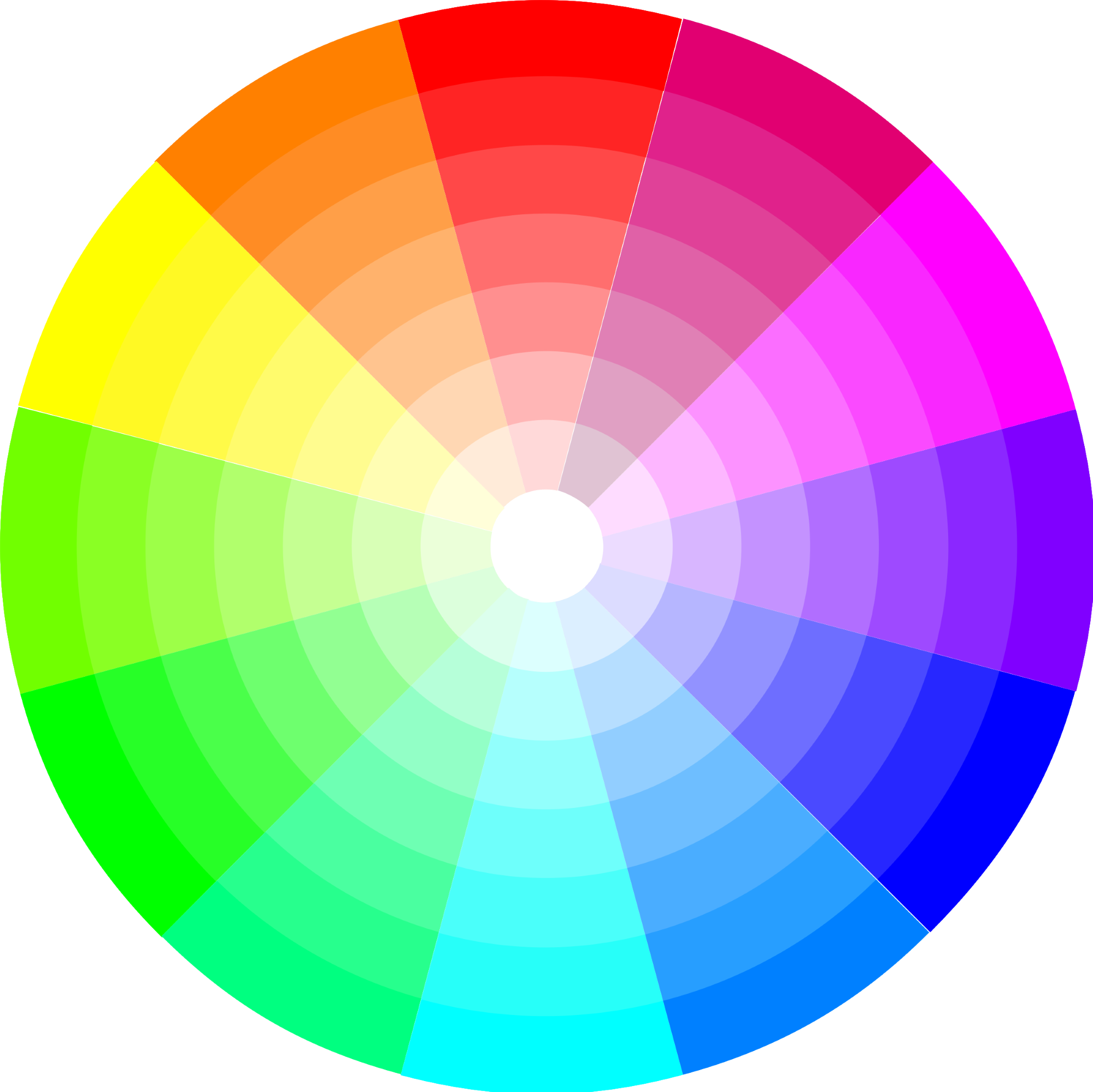
If you’re like most people I meet with to discuss colors, the idea of “complimentary” colors is anything but straightforward.
What is meant by complimentary? How can you tell if colors are complimentary to one another or whether they will clash?
One easy tool for determining this is the color wheel. The color wheel is a simple visual tool used by artists, painters, and designers to arrange the primary colors.
Contrary to what is often our gut instinct, colors that are directly opposite one another are complimentary to one another. Reds and greens, for instance, are complimentary. So are blues and oranges. Yellows and purples.
It can often work well to “triangulate” three colors when painting and decorating – using for instance tones of blue, red, and yellow. These three colors, while not directly across from one another, are about equal distance apart, meaning they often work well together.
Don’t feel you need to slavishly adhere to any hard and fast rules when it comes to the color wheel, but allow it to guide you on which primary tones may compliment one another. You may find yourself pleasantly surprised by the results.
Choosing Interior Paint Colors Tip #5 :
Add Color with Furnishings or Accent Walls
One of the concerns most people have when it comes to colors is whether a color – especially a vibrant or a dark color – may be “too much” for a space.
It is a legitimate concern. Sometimes a smaller punch of color has more impact than drenching a room in a single color. If you’re unsure about using too much of a color in a space, you can consider one of a couple of options.
Consider using a neutral color in the room such as a tan or a gray, and bring the desired punches of accent color into the room utilizing furnishings such as rugs, throw pillows, art, or décor.
For a further punch of color, consider painting a single “accent wall” in the desired color while using a more neutral tone in the rest of the room.
An accent well, especially in a high impact visual area of a room (such as the first wall a person entering the room would see) adds a tremendous effect of color to a space without drowning a room in a single monotone.
Choosing Interior Paint Colors Tip #6 :
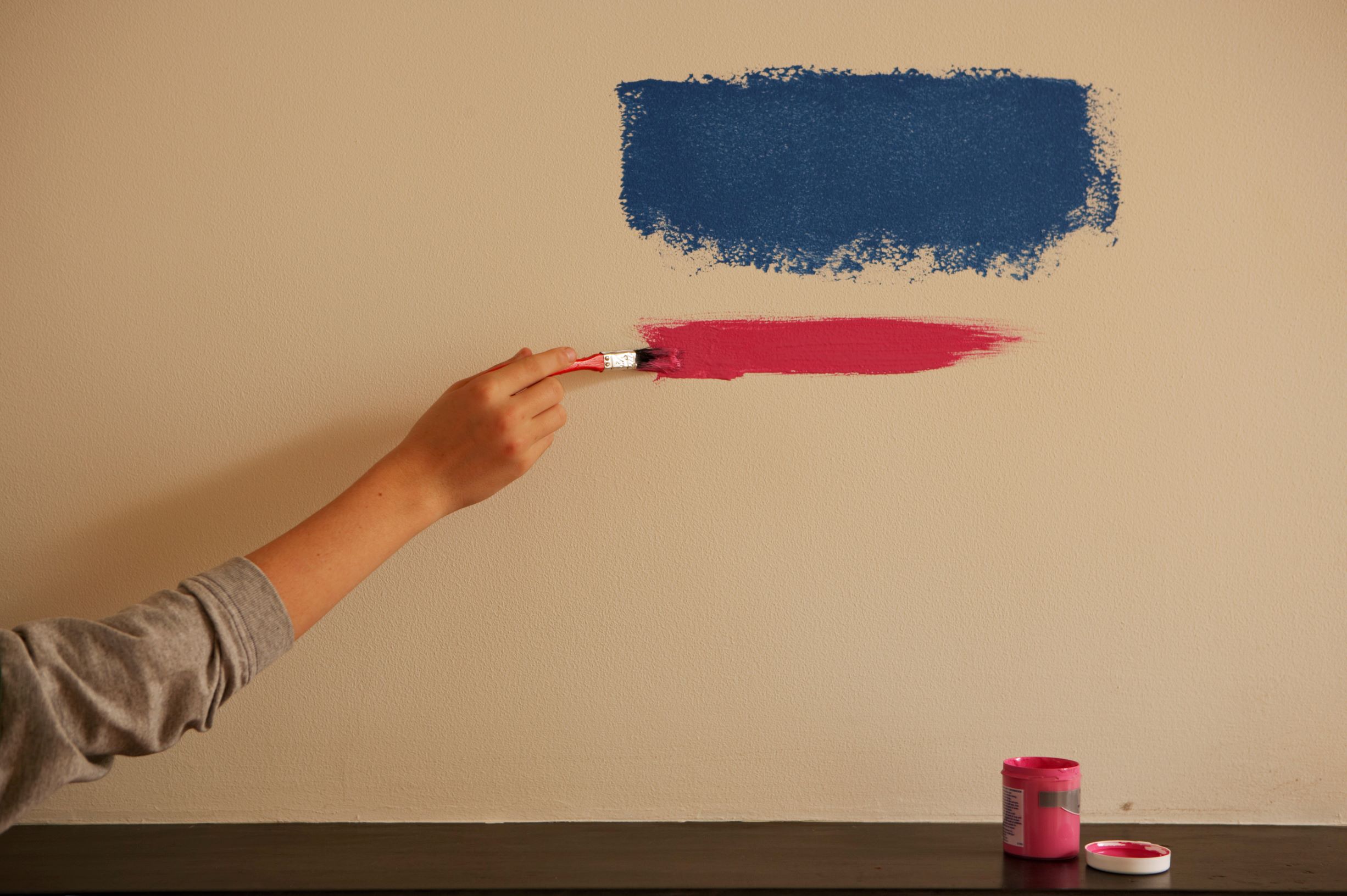
Paint A Sample
If you’re unsure about your color selection, or if you’re caught between a few different colors, one of the best visual methods of choosing interior paint colors is to paint a larger sample that you can try in your space.
It’s nearly impossible to visualize a room based on a tiny paint swatch from a color deck. Having a single 3’ x 3’ section of spare drywall that you can try colors out on and hold up to your space and furnishings is a great way to help you select the best option.
Paint and home improvement stores sell small pint sample-size paints for $3-5. Pick up two or three different colors, paint the test drywall, and set that up in your space. Prop it against a countertop, or on top of the sofa.
This will give you an opportunity to compare and contrast how your paint selections look with your décor as well as in the lighting of your home – which is very different than the typical fluorescent lighting inside a store.


"I did not know how to paint or even what to paint, but I knew I had to begin." Margaret Atwood, Cat's Eye
Join my monthly email newsletter, "Dip & Swipe", for professional tips, how-to articles, color and decorating ideas, projects, and much more!
Recent Articles
-
Repurpose Old Windows
Dec 10, 21 06:32 PM
 Learn how to repurpose old windows by upcycling them into shabby chic decor.
 -
Upcycling a Toolbox
Dec 08, 21 10:22 PM
 In this craft painting project, I upcycle an old toolbox with fresh paint and an appliqué.
 -
Craft Painting Projects
Dec 08, 21 08:13 PM
 A place for all of my smaller craft painting projects and DIY projects that don't fit elsewhere.
Follow me on Pinterest @