Interior Paint Color Combinations
Selecting interior paint color combinations can be a tricky business. You may want to paint a room more than a single color, for effect or impact. Or you may have an open floor plan, or rooms that share a wall, so you’ll want to choose two colors that compliment or accentuate one another.
Every room is a combination of different colors, textures, and lighting. So how do know which interior paint color combination will work?
There are no “right” or “wrong” answers and no hard rules when it comes to this question. Some of it is trial and error, some is personal taste. But I’ve included some tips you can follow to help you find the right color combinations for your space.

Interior Paint Color Combinations:
Tip #1 : Start With A Base Color
The first step in determining your interior paint color combinations is to select your base color. Every room or space has a single primary color that dominates the room.
Secondary color choices can be incorporated in a number of ways – through trim, accent walls, stripes, wainscoting, ceilings, etc… Secondary colors can also be brought forward through décor, draperies, fabrics, pillows, furnishings, cabinetry, and artwork.
For step-by-step tips to help you determine your primary color selection, refer to the Choosing Interior Paint Colors page.
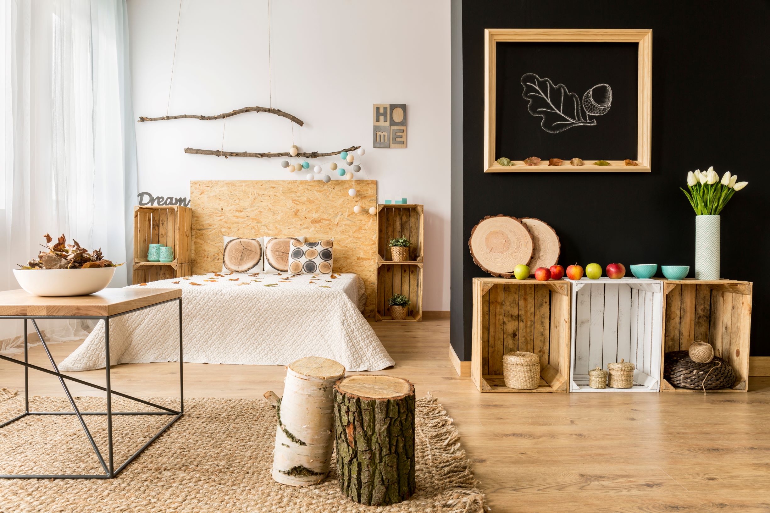
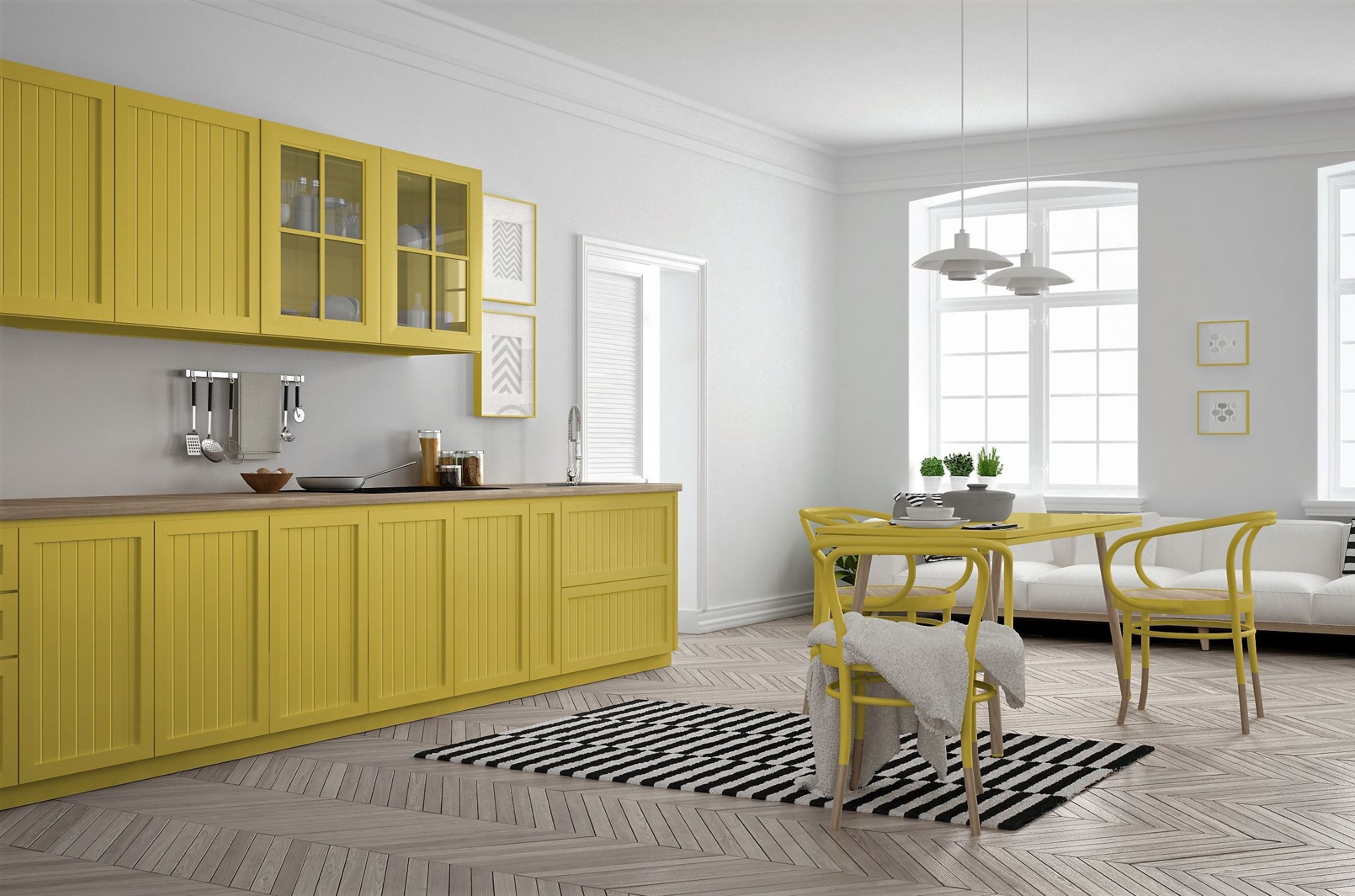
Tip #2 : Utilize a Neutral or Earth Tone
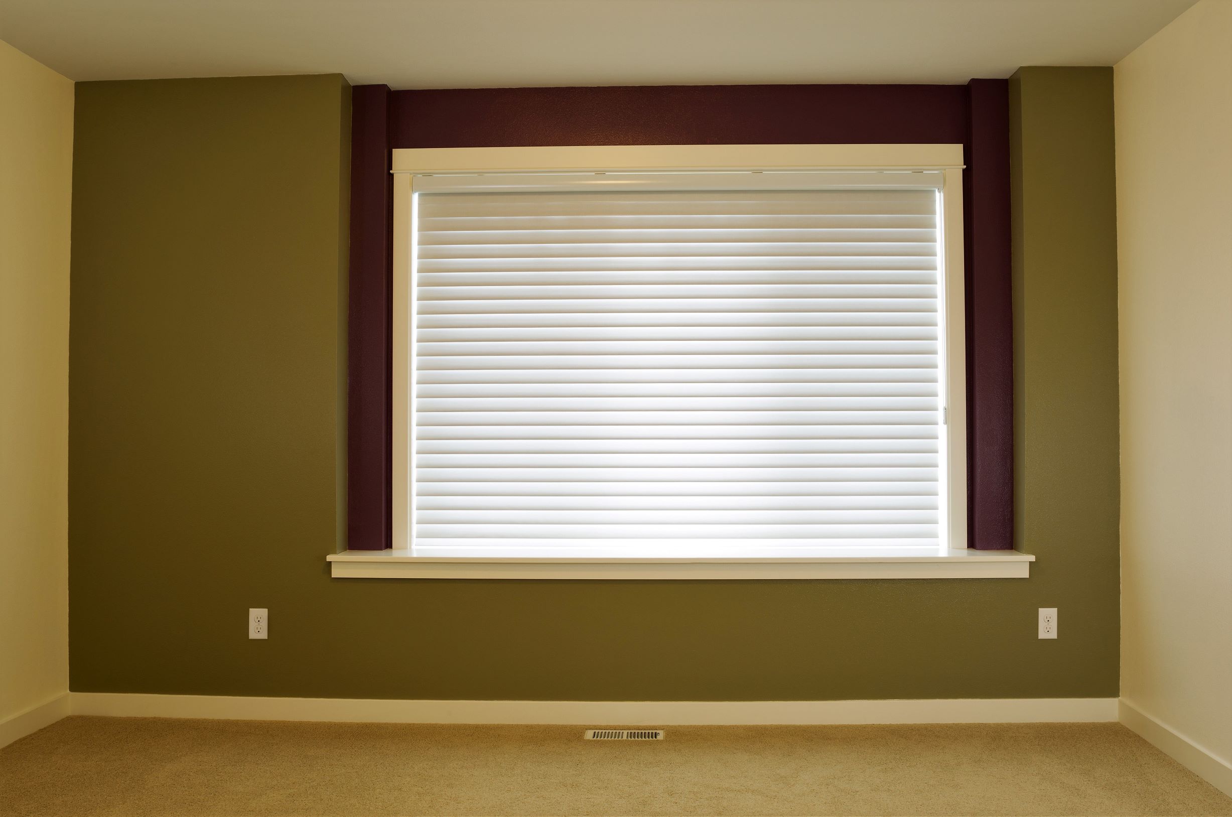
One great way to add impact through interior paint color combinations is using the contrast of brighter colors with neutral or earth tones.
Even if you love color, neutrals should form the backbone of your decor.
Pairing, for instance, a tawny yellow with a medium gray is a great way to add both contrast and a sunny Tuscan feel to a room without creating the need for sunglasses!
Neutral colors are colors that provide a solid base or background to your decor and furnishings. Some common examples of neutral colors:
- White and off-whites
- Creams and ivories
- Khakis
- Beige
- Tans
- Light Grays
- Greiges (Gray with brown undertones)
- Charcoal Gray
Earth tones are tones found frequently in nature, such as:
- Browns
- Light Greens
- Terra Cotta or Clay Reds
- Stone Grays
Darker primaries like blues and reds often pair great with creams, antique whites, and light grays.
Builder’s white is sterile, a blank canvas which no one should leave untouched. But off-whites and creams and grays and light browns invoke a much warmer feel.
Often they are best utilized as a base color for a room, and color can be incorporated either in small areas – think above soffits or chair rails or on accent walls – or through décor and furnishings.
Two neutrals can be used to give a room or a space variation, or where a shared wall may create an issue with one space flowing into another. For example, a medium gray tone and a rich cream tone can work well within the same space, to be accentuated by décor or accent colors.
Some neutral color combinations that work well:
- Antique White with Navy or Darker Blues
- Cream or Ivory with Red or Burnt Orange
- Charcoal Gray with Mustard or Sunny Yellows
- Tan or Light Gray with Hunter Green
- Espresso or Mahogany with Sage Green
- Black and White (creates a formal appearance)
The right interior paint color combinations for your space will vary depending upon your:
- Personal Style
- The Use (or Mood) of the Room
- Natural Lighting (darker colors can be used with sufficient natural light)
Tip #3 : Use an Artist's Color Wheel
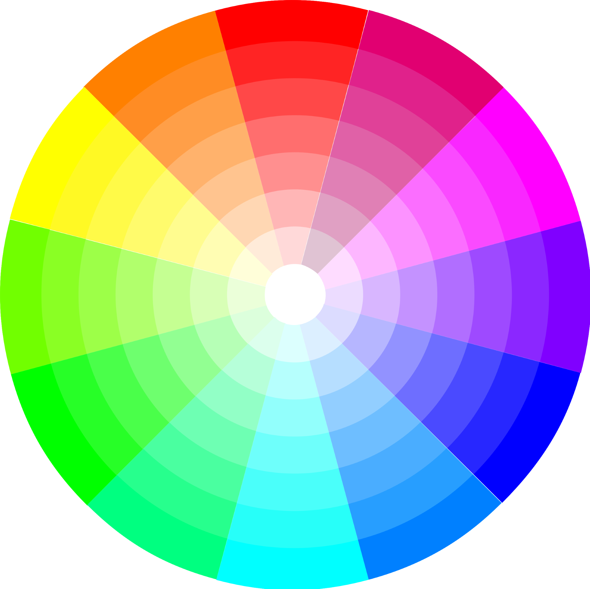
As also discussed on the Choosing Interior Paint Colors page, one great way to help choose “complimentary” paint color combinations is to use a color wheel.
Color wheels are a visual tool used by artists, painters, and designers to arrange the primary colors. Colors that are directly opposite one another are complimentary. Green and Red. Yellow and Purple (or Dark Blue). Blue and Orange.
The color wheel is simply a guide and can help you determine a set of general guidelines, especially if you’re caught between a couple of colors. There is no need to comply by any hard color rules, and the color wheel is flexible.
One good rule of thumb is not to utilize colors that are right next to each other on the color wheel. Red and Dark Orange, for example. It has the effect of creating too much “likeness” and of each drowning out the impact of the other.
Tip #4 : Utilizing Adjacent Spaces
One factor to consider when choosing interior paint color combinations is ensuring that your room or space flows well with adjacent rooms or spaces.
Most modern houses are built using open floor plans, meaning that rooms are frequently open to one another. They may share walls with minimal division between them. How do you make sure your newly painted space works with those other visible spaces?
For starters, you don’t need to match colors between those adjacent spaces. The base tones of the room merely need to be complimentary to one another, not matching.
Create enough visual relation between rooms to give the feel of flow from one area into another. Pair cool colors with adjacent cools and warm colors with warms.
For example, if you have warm colors such as cream and red in an existing room, pairing that with complimentary warm tones such as browns or mustard yellows in an adjacent room creates a cohesive “feel” in spite of differing color schemes.
Tip #5 : Experiment!
The great benefit of painting is that you aren’t “stuck” with anything! Sometimes you need to trust your instincts and pick out colors that speak to you.
Unlike other types of home improvement projects, such as furniture or landscaping or home remodels, paint is easy to change.
Try some unique or different interior paint color combinations. Go bold – especially in a space, such as a child’s room – where you feel like you can let your creativity speak (or shout)!
Its often preferable to experiment with color in a room that can be closed off with a door, but work more cohesively in rooms open to one another or with shared space.
At worst, if a paint color or color combination doesn’t work in a space you are out the cost of the paint and the time invested in the painting.
A new paint color is just a trip to the paint store away.
Tip #6 : A Shade Darker
I love color in a space. Color, especially dark color, should always be balanced with lighter or brighter furnishings, fabrics, secondary colors, and trim.
Paint color decks are usually arranged in a convenient gradation of hues from light to dark. Find the color (or color family) you like best.
My general advice is to choose one shade darker on the color swatch than the color you initially pick.
In my experience, far more homeowners I've worked with wish they'd have gone darker or bolder in their color selections rather than lighter.
One reason for this is that we tend to be overly conservative in our choices, fearing to go too bold, and then are just as frequently disappointed when the colors don't have the impact or brightness we really desired.
Fluorescent lighting in paint stores can also make a color appear brighter and cooler than it is. Natural and incandescent lighting in the home is warmer and not as intense.
Choosing colors that are too dark, especially if your room does not have good natural lighting, can make a space appear smaller than it is, so use your own good sense on both the size of the room and the lighting of the space.
One other factor to consider is the sheen of the paint you've chosen. Glossier-finish paints can appear darker by reflecting more of the available light. Matte and eggshell finishes appear brighter and truer to the paint color.
Tip #7 : Always Test Your Colors
All interior paint color combinations are theoretical until you've tested them in your space.
I can't stress it enough, but before you commit to five or ten gallons of paint in the colors you've selected, buy them in small pint-sized sample bottles.
Test your paint colors by painting one-foot square test patches in at least two spots in the room with different lighting.
Paint one set across from a window or in direct interior lighting, and another test spot in one of the space's more poorly lit areas.
This will give you the idea of both how well the colors you've selected work with one another and how they look within the lighting and decor of your space.
If something seems off, you can make adjustments before you've dropped $500+ on non-returnable supplies!
Tip #8 : Look for Inspiration
The internet and the bookstore or magazine stand are great places to look for inspiration.
Pinterest, home improvement magazines, Google Image Search, and home improvement books can all give you ideas for combining color with the room's use and your personality.
Color selection and interior paint color combinations are individual choices, but they are often tied to a room’s use. How you use a space is vital to the color choices, or mood, you want to project.
The perfect colors for a child’s nursery are obviously much different than the color selections used in a formal dining room or a study.
Elsewhere on the site I have put together groups of ideas – themes, color choices, moods – on a room-by-room basis to help you select the right feel and design and décor for YOUR space.

"I did not know how to paint or even what to paint, but I knew I had to begin." Margaret Atwood, Cat's Eye
Join my monthly email newsletter, "Dip & Swipe", for professional tips, how-to articles, color and decorating ideas, projects, and much more!
Recent Articles
-
Repurpose Old Windows
Dec 10, 21 06:32 PM
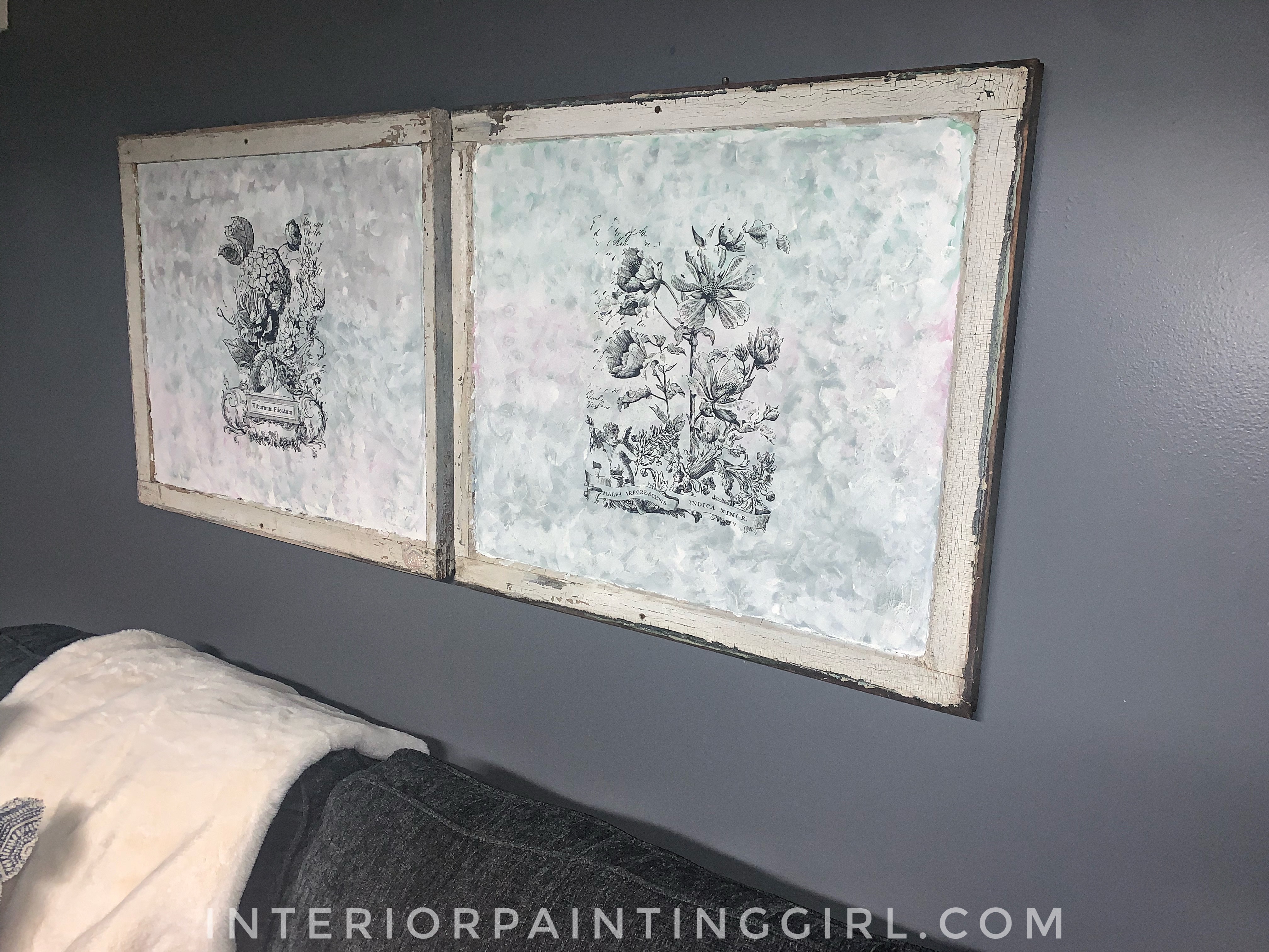 Learn how to repurpose old windows by upcycling them into shabby chic decor.
 -
Upcycling a Toolbox
Dec 08, 21 10:22 PM
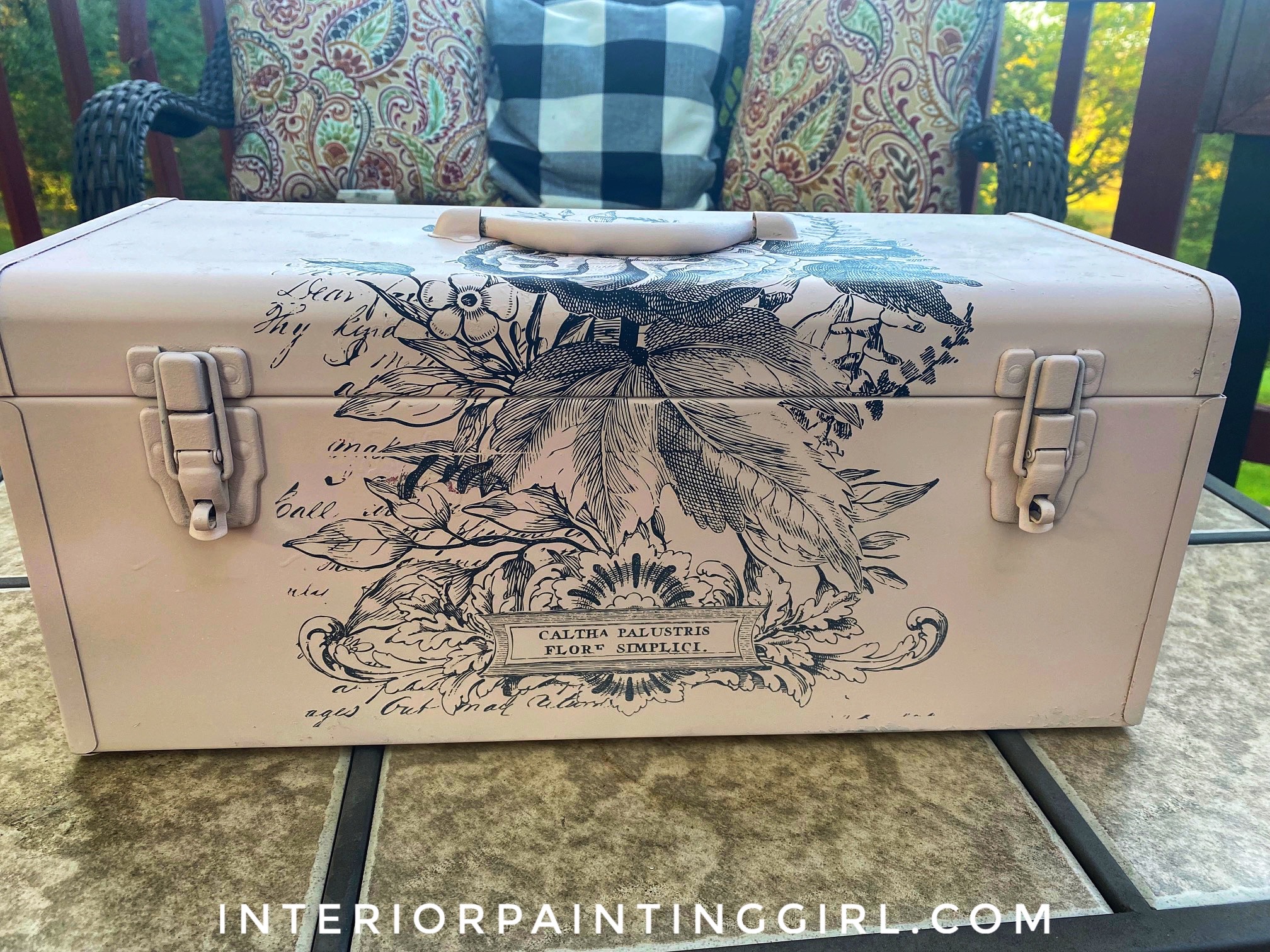 In this craft painting project, I upcycle an old toolbox with fresh paint and an appliqué.
 -
Craft Painting Projects
Dec 08, 21 08:13 PM
 A place for all of my smaller craft painting projects and DIY projects that don't fit elsewhere.
Follow me on Pinterest @